Matrixplot
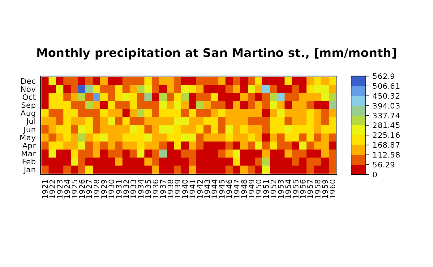
matrixplot.RdPlots a color matrix, representing the values stored in x.
Originally, it was thought to represent the amount of days with information per year in a set of gauging stations, but it can be used for plotting the information stored in any two dimensional matrix.
Usage
matrixplot(x, ColorRamp="Days", ncolors = 10, main = "",
           cuts,  cuts.dec=2, cuts.labels,
           cuts.style=c("equal", "pretty", "fixed", "sd", "quantile",
                        "kmeans", "bclust", "fisher"),
           legend.cex=0.8,  legend.title="",  legend.title.cex=1.5,
           legend.fontsize=15, ...)
Arguments
- x
matrix to be plotted. Originally:
-) Each column ofxrepresent a different gauging station, and it stores the values measured on it
-) Each row ofxrepresent the years, and they stores the amount of days with information in each station- ColorRamp
Character or function defining a personalized color ramp for plotting the maps.
Valid character values are in c("Days", "Precipitation", "Temperature", "PCPAnomaly", "PCPAnomaly2" "TEMPAnomaly", "TEMPAnomaly2", "TEMPAnomaly3").- ncolors
numeric, indicating the number of color intervals that will be used for representing the information content of
x.- main
Main title for the plot
- cuts
Numeric, indicating the values used to divide the range of 'x' in the legend of colours. If not provided, it is automatically selected as a function of 'lenght(ColorRamp)'.
- cuts.dec
Number of decimal places used to present the numbers that divide the range of 'x' in the legend of colours.
- cuts.labels
Character indicating the label to be used in the ccolour legend for each one of the values defined by 'cuts'. If not provided, as.character(cuts)' is used.
- cuts.style
character, indicating how to finding class intervals for continuous numerical variables for choosing colours to be used in the figure. See
classIntervals- legend.cex
character expansion factor *relative* to current
par("cex")used for the legend text.- legend.title
text to be displayed above the legned of colours (e.g., showing the measurement units of the raster being displayed).
- legend.title.cex
expansion factor(s) for the legend title. Currently it is not used. See
legend.fontsizeinstead.- legend.fontsize
size of text (in points) used in the legend title (e.g., showing the measurement units of the raster being displayed).
- ...
further arguments passed to
levelplotfunction (lattice package) or from other methods
Details
The default levelplot panel draws dotted grey lines along
cell boundaries, making individual matrix values easier to distinguish.
Author
Mauricio Zambrano-Bigiarini, mzb.devel@gmail
Note
Adapted from a not available web page (http://www2.warwick.ac.uk/fac/sci/moac/currentstudents/peter_cock/r/matrix_contour/)
Examples
## Loading the SanMartino precipitation data
data(SanMartinoPPts)

# Selecting only the values up to Dec/1960
x <- window(SanMartinoPPts, end=as.Date("1960-12-31"))

## Daily zoo to monthly zoo
m <- daily2monthly(x, FUN=sum, na.rm=TRUE)

# Creating a data.frame with monthly values per year in each column
M <- matrix(m, ncol=12, byrow=TRUE)
colnames(M) <- month.abb
rownames(M) <- unique(format(time(m), "%Y"))

# Plotting the monthly precipitation values from 1921 to 1960.
# Useful for identifying dry/wet months
matrixplot(M, ColorRamp="Precipitation",
           main="Monthly precipitation at San Martino st., [mm/month]")